Scholastic Script Font: Elevating Digital Brand Identity
In digital design, typography is more than just words on a screen. It is the foundational voice of a brand’s online presence, setting tone, establishing trust, and guiding user behavior. For designers crafting websites, landing pages, or app interfaces, the search for a typeface that balances elegance with digital practicality is constant. The Scholastic script font enters this space as a refined asset, offering a distinct personality capable of transforming standard layouts into memorable brand experiences.
The Digital Character of Scholastic
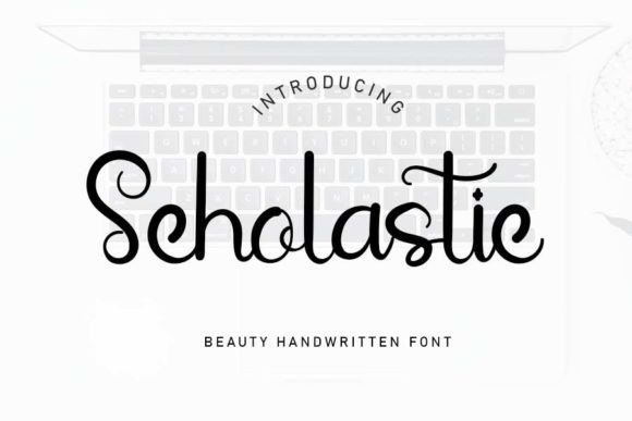
Scholastic is an elegant and refined script font. Its strokes carry a sense of deliberate craftsmanship—fluid yet controlled, sophisticated without being overly ornate. This makes it a versatile display font within the Script Amp category. Unlike many handwritten or casual script fonts, Scholastic maintains a clarity and structure that is crucial for digital readability. Its personality is one of trusted authority and creative confidence, ideal for brands wanting to convey premium quality, expertise, or artistic integrity online.
In a practical sense, this means Scholastic performs exceptionally well as a visual anchor. It doesn’t fade into the background; it commands respectful attention. This character is perfect for establishing a strong visual hierarchy immediately, guiding a visitor’s eye to the most important message on a page.
Strategic Applications in Web and UI Design
Where should this font live in your designs? Scholastic excels in focal points.
Hero Sections and Landing Page Headers
The hero area of a website is your first and most critical impression. Using Scholastic for the main headline instantly sets a tone of refinement. For a creative portfolio, it signals artistic skill. For a coaching or consultancy website, it communicates expertise and personalized service. On a product landing page for a luxury item or a SaaS tool, it elevates the perceived value and professionalism.
Call-to-Action Emphasis and Button Text
While not typically used for long body text, Scholastic can be powerfully applied to short, decisive phrases like “Get Started,” “Book a Call,” or “Download Now” on primary buttons. This draws direct attention to conversion points, making the action feel more intentional and premium. Ensure the button has ample padding and a clean background to maintain the font’s legibility.
Brand Accents and Logotype
For logo design used on websites, especially for boutique online stores, creative agencies, or digital brand kits, Scholastic offers a ready-made logotype option. Its inherent elegance can serve as the cornerstone of a consistent online identity, repeated in navigation labels, section titles, and footer branding to create a cohesive experience.
Supporting Graphics and Editorial Highlights
In blog graphics, quote overlays, course sales page module titles, or digital ad creatives, Scholastic can highlight key phrases. It pairs beautifully with imagery, providing a human, crafted touch to otherwise static layouts.
Readability and Responsive Layout Considerations
Any decorative script font requires thoughtful implementation to maintain usability. For Scholastic, the key is size, spacing, and contrast.
- Mobile Screens: Increase the font size relative to its desktop use. On mobile, a headline set in Scholastic might need to be 20-30% larger to preserve character detail and legibility. Avoid using it for very small text labels.
- Background Contrast: Ensure high contrast between the font color and its background, whether on dark or light themes. A subtle drop shadow or very slight background tint can help when placing it over complex images.
- Spacing: Provide generous letter-spacing (tracking) in CSS if the default rendering feels too tight for longer phrases. This improves scanning behavior at larger sizes.
Remember, its primary role is for display. Keep body copy and extended reading material in a more neutral supporting typeface.
Crafting a Cohesive Typographic System
A single font does not make a layout. Font pairing is essential. Scholastic, as a distinctive script, needs a simple, highly readable partner for paragraphs, lists, and UI elements.
- For a modern, clean digital identity, pair Scholastic with a geometric sans serif font (like Poppins, Inter, or Montserrat) for body copy. This creates a clear hierarchy: elegance for headlines, clarity for content.
- For a more editorial or traditional brand tone, consider pairing it with a classic serif font (like Georgia, Merriweather, or a premium serif like Caslon) for body text. This combination leans into authority and timelessness.
Always test pairings at various sizes and in different layout modules to ensure rhythm and balance.
Technical and Licensing Notes for Digital Projects
Before integrating Scholastic into a live website or client project, verify its technical specifications as a commercial font.
- Webfont Formats: Ensure it is available in standard webfont formats (WOFF2, WOFF) for reliable cross-browser performance. Good fonts often include optimized files for web use.
- Styles & Features: Check if it includes multiple weights or stylistic alternates. Even a single-weight script font can be powerful if it has a robust character set and good multilingual support for international brand projects.
- Commercial Licensing: Confirm the license covers use in website embedding, client projects, digital templates, and online store assets. This is crucial for professional designers and agencies building brand assets for others.
Implementing it via a reliable font delivery service or a properly optimized @font-face rule will ensure it loads quickly and renders consistently, protecting both user engagement and brand professionalism.
The Impact on Brand Perception and User Trust
Ultimately, a font like Scholastic works on a psychological level. In a crowded digital space, a refined, consistent typographic choice signals care and intention. Users subconsciously associate this visual polish with trustworthiness and quality. For a landing page, this can reduce bounce rates. For an online store, it can enhance the perceived value of products. For a portfolio site, it can make a designer’s work feel more curated and intentional.
By using Scholastic strategically—not everywhere, but at key moments of emphasis—you create a digital experience that feels designed, not just assembled. It becomes a silent ambassador for the brand, elevating every headline, call-to-action, and logo impression into a cohesive statement of identity. This is the real power of a thoughtful typeface choice in web design: it builds relationships before a single word is consciously read.